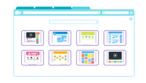
The design for a business website application is often neglected. Therefore, most of the applications fail to meet the user’s or businesses needs. This might contribute to poor user experience or loss of profits.
Here are some of the valuable tips will help you to design a great website application.
Clear primary action
Most of the data entry form have at least two buttons which you can use for closing the form. One of the buttons is used for saving the data while the other one can be used for closing the form without saving. You can also have another button for blanking all the fields.
Two different buttons can be utilized for saving data, one for submitting the data and one for saving and returning later. However, is very critical for the users to understand how the primary button can be highlighted for completing their request.
For instance, the two saving options that are in bold would complete the form. They should, therefore, stand out clearly to the user.
- Cancelling
- Resetting the form
- Saving and then continue
- Finally, save and complete
Identification of the required fields
Sometimes upon entering the minimum information that might be necessary for a certain form, you are told that some have been left blank. A good example is phone numbers. Why do some companies require both the phone number and the email address as well?
You should be in a position to identify all the required field when completing the form.
Complete steps of the multi-tabbed forms
Forms having many fields that need to be completed might be broken down into groups that will be shown on different tabs. The separate tabs make the form clearer and also helps in guiding the user about the order to be followed when completing the forms.
Disclose the information gradually
Users should not be loaded with too much information on your website, especially during the first visit. This can be done by having minimal information on the landing or home page. Links should be provided to the users who may require more information.
Lazy registration you should relax the need for registering new visitors. This gives them ample time for trying out some important features before they sign up to reveal their identity.
Clear subscription plans
Any signup/subscription plans should be made clear for the users to understand. A good plan helps to improve the overall branding of your website.
Forgiving form validation
Avoid penalizing your users for either failing to enter or not entering data. You should avoid blanking all the fields as this may lead to omissions when the users are filling the forms. Subjecting the users to some terms and conditions when they are re-entering the fields could be very frustrating.
Breadcrumbs and navigation
A breadcrumb trail should be provided in every website. It helps to show all the pages visited by the user. This prevents them from feeling disoriented or lost when they visit your website.…


